This story was originally published by Curbed before it joined New York Magazine. You can visit the Curbed archive at archive.curbed.com to read all stories published before October 2020.
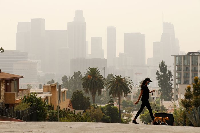
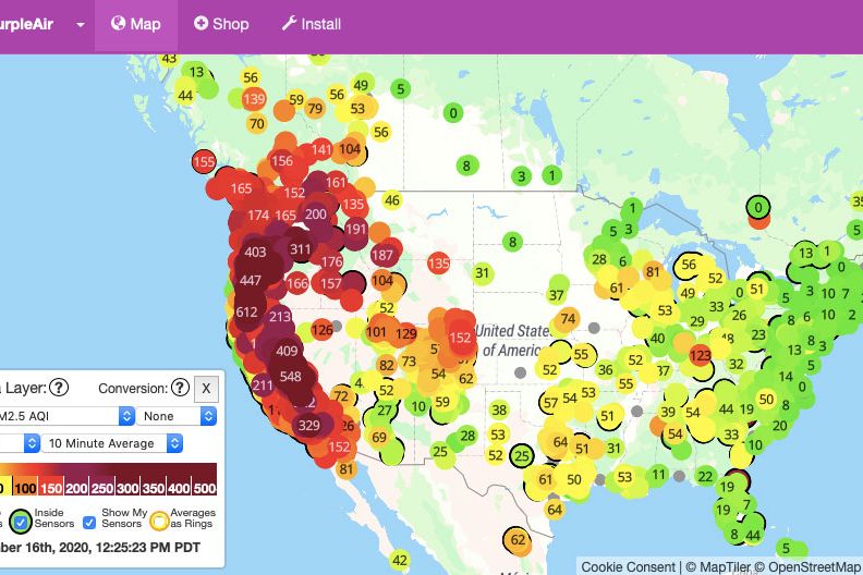
While the world gaped at the photos when the West Coast skies turned orange, the truth for many residents here is that orange would have been a welcome relief, as opposed to red, purple, or deep maroon. Not the color of the sky, of course, but the color-coded index of toxic airborne pollutants, which, this week, reached maroon level — hazardous — for much of the western third of the United States. And inevitably, because there’s an app for that, a huge number of Westerners are glued to their air-quality trackers, structuring their lives around whether their hometown dot is closer to green than to burgundy.
Air-quality apps have become a constant — don’t make me say they’re the summer’s hottest item — for those living in the states where hundreds of wildfires have created smoky skies and burning eyes for tens of millions of people. As cities in the Pacific Northwest, like Portland and Seattle, recorded some of the worst air quality in the world, all eyes were on apps like AirVisual, AirNow, and PurpleAir, with their readings escalating, in some cases, beyond what some apps could reliably measure.
Air-quality index, or AQI, is the Environmental Protection Agency’s method of reporting hazards from five major airborne pollutants including ozone, carbon monoxide, and nitrogen dioxide. But the most relevant pollutant during wildfire season is PM2.5 particulate pollution — named for the size of the particles, which is 2.5 microns, or thousandths of a millimeter — embedding itself into your lungs. In the broadest description, it’s superfine dust, ash, and soot.
The color-coded values that the apps display indicate risk. Zero to 50 (green) is likely healthy for all; 101 to 150 (orange) is where breathing may get difficult for “sensitive groups” like young children, older adults, or people with chronic respiratory issues like asthma. Anything over 300 (maroon) is flat-out dangerous, triggering warnings of potentially lasting health effects — short-term and long-term — on people who go outdoors. It officially tops out at 500, which is really bad, but the past week saw readings even higher.
In non-apocalyptic times, apps that track AQI can be a helpful tool for planning outdoor activity; you could schedule a hike, say, for the cleanest time of day. While ash is raining from the sky, however, these apps instead become a survival tool, a coping mechanism, and a reminder of how often you’ll need to change the air filters in your HVAC systems.
As we reach the six-month mark of a life spent indoors, staring at our screens, the data has become a welcome distraction. “I have spent, conservatively, 40 hours looking at air-quality data since last Thursday,” said Rabi Abonour, an L.A.-based advocate for sustainable transportation. Checking an air-quality app is a — if not quite pleasant, then at least slightly less morbid — break from doom-scrolling the flood of pandemic-related numbers like case counts and test positivity rates. (Self-care advice: Don’t scroll all the way back to April and look at those slideshows of sparkling, clear-skied cities under lockdown.) As you wallow in the depths of dark red, urging the index to creep back down is a 2020 version of cheering for your team — go, Green! — and quite a few users have equated their addiction to watching sports. “Anyone else refreshing AQI apps like ESPN dashboards?” asked Annie Fryman, a Bay Area housing and transportation policy-maker. “I just caught myself reflexively cheering at a 142 after a day of 160s.”
This addiction is likely to spread. Last year, Apple added AQI to its daily forecast, and, just this summer, AccuWeather did too. But the tricky thing about forecasting air quality is that the factors contributing to a bad air day are not so easy to predict in advance — plus fires themselves are erratic — at most, it’s an educated guess. Topography, wind, and microclimates can influence readings, as well as specifics like being close to freeways or factories. Better data relies on lots of sensors, and some apps, like PurpleAir, use information gathered largely by a network of monitors installed by users. So if you’re so inclined, while you obsessively self-monitor the air outside your home, you can contribute to the crowdsourced cause, helping to paint a more complete color-by-number AQI picture.
With this week’s news that the smoke from the fires has made it to the East Coast, creating hazy skies and tangerine sunsets, the rest of the country might be wondering if an air-quality app is right for them. In a changed climate, where six out of 20 of the largest fires in California history are currently burning, smoke events like the one billowing across the continent could certainly become more frequent. But all big cities already have particulate-matter problems of their own, at least sometimes. On hot days, PM2.5 pollution and ground-level ozone, which come from (among other things) brake-pad dust and vehicle exhaust, can reach unhealthy levels on city streets. And not all of the worst air-quality problems we face are outdoors — finding out just how bad your gas range is will truly tighten your chest.


